Audivi
I came, I saw, I heard
Audivi was a student project for which I was the sole designer. This audio tour app was designed for augmenting the user experience at museums, and quickly expanded for application at zoo’s, aquariums, heritage sites, and other educational experiences.
Many Audio tour apps are clunky, buggy,
difficult to use, and immediately deleted after one afternoon at the museum. My goal was to design an audio tour app that wouldn't be deleted same day; full of fun and useful features, easy and intuitive to use, which regularly engaged the users with the exhibits, the app and each other.

What's the problem with audio tours?

Inhibits Freedom of Interaction and Exploration
18.9%
Poor App Functionality and Features
24.3%
Other Preferences
8.1%
Poor Audio Performance
13.5%
App Download and Setup
13.5%
Loaned Device Hygiene
8.1%
Budget
2.7%
Distances Shared Experiences
10.8%
Research
Preliminary survey questions helped guide the initial design process and highlight necessary changes to standard audio tour practices.
My survey revealed two distinct groups of audio tour pain points.
The first group was failures in practical useability and features. 24.3% of survey responses mentioned general lack of useability due to many audio tours lacking simple functions, such as the ability to pause and play a track, fast forward, or even navigate tracks independently at all. An additional 8.1% of comments bemoaned the germ-y aspect of borrowing loaner devices from a museum. This allows a well constructed app to mitigate over 1/3 of users most common audio tour concerns.
The second group culminates to a lack of artistry in guiding users through an engaging and enjoyable experience at the museum. 18.9% of user opinions expressed concerns about pre-fab tours restricting their ability to freely explore institutions, and an additional 10.8% felt like audio tours plugged them into a device, separating them from friends and family they came to enjoy the day with. This has nearly 30% of users in need of an audio tour experience that gives them the freedom to explore with a structure that encourages interacting with those around them.
Practical Concerns
While survey participants frequently mentioned a desire for simple fixes that would be found on any popular audio app; such as play/pause, skipping tracks, subtitles and speed control, a more pressing practical concern was many user's desire not to download any kind of app at all.
Small museums and other cultural and education institutions often lack the resources to create a quality app on their own; and the users who are willing to download an individual app for every place they visit will often delete it the same afternoon they download it-and for good reason. Why keep an app around for just one museum you're unlikely to visit again in the next year, or ever? This quickly led me to change the scope of my project.
I chose to expand Audivi from an audio tour app for one museum to a multifaceted platform which could support variety of museums, heritage sites, and other educational institutions uploading their own audio tour tracks and information. Institutions could enjoy a high end app without investing a large amount of resources creating their own, and users could have one app through which they enjoyed audio tours and extra content for a variety of education institutions.
What did users have to say?
On Practical Issues
"They are often too slow, missing functionality which would improve the experience (fast forward, speed control, subtitles)."
"I usually need the audio too loud and worry I am disturbing other patrons.... if they don’t connect to hearing aids/headphones via Bluetooth it is hard..."
"They require extra steps and often registration. Sometimes there’s no WiFi and I’m expected to use my data."
On the Experience:
"...it seems rote and overly structured. I want to explore, not have someone tell me what to do!"
"Audio tours have a weird way of separating the people I’m with from each other. For example, it minimizes my conversation with my partner … so we have more separate experiences rather than a shared experience"
" [It is unhelpful or frustrating] When it tells you the meaning or a view of the art instead of adding in questions or thoughts for the viewer to deliberate on"
Shaping an Experience
Many users wished to explore museums independently of a guided tour, while still being able to learn what an audio tour has to offer. From the beginning I felt it was important to include the ability to independently navigate audio tracks for each exhibit via maps, search, scan, or a track list to encourage freestyle exploration and help combat pacing issues that clump guests around specific areas. For those who enjoy a structured tour guiding them physically, I chose to include a map feature and playlists of audio tour tracks in the same order as the physical exhibit.
Going out to a museum for the day can be a group activity, date night, or outing with a friend; it is often a social experience. Users felt that listening to audio tours was an individual activity that diminished connection with those they came to spend time with. So how can we take the isolating experience of interacting with one's phone, and make it a shared experience? In addition to allowing users to be more flexible in how they navigate the museum, I chose to include games, such as trivia, scavenger hunts, and crossword puzzles, to encourage users to interact with the exhibits, their companions, and other patrons.
Users also expressed concern that tours limited independent thought about the art and exhibits. A discussion forum specifically built to encourage users to examine exhibits together was my solution to foster independent thought, challenge users intellectually, promote community, and aid in long term retention of Audivi.
Low Fidelity Wireframes
A camera icon in every search bar is a shortcut to search via QR code or search by scanning a painting.
A prominent language option aids foreign tourists learning abroad.

An uncluttered home screen is easier for less tech literate users to navigate.
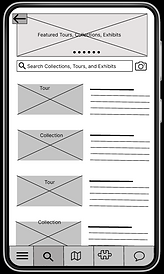


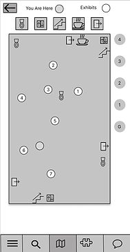
Clickable icons highlight important areas on the map.
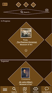
I gave the games section a diamond scheme to keep it fun and distinct from other functions.
A banner alternates between new and featured exhibits the museum chooses to highlight.
A navigation bar on the bottom is easy to use and familiar to many users who frequent apps like Facebook, Instagram, and Amazon.
The map section can be used to navigate to specific exhibits and play associated audio tracks, or to navigate to important areas like restrooms, elevators, and exits.
Games promote patrons working on something as a group, exploring the museum, and sharing scores with other patrons.

A option to rate exhibits encourages users to share their opinions and actively create discussions.
Discussion encourages users to dig deeper into exhibits, have fun sharing their honest opinions, interact with other patrons, and continue to think about exhibits after their day at the museum is over.
Low Fidelity Prototype
The low fidelity prototype acted as a springboard for new ideas and a victim for user testing.
Explore it Here.

Useability Studies
Research methodology consisted of individual interviews where users were asked to perform a variety of tasks within the app prototype.
I organized Usability Study results via sticky note for ease of use. Each sticky note on my affinity diagram has a user comment or an issue I spotted during studies. Notes are also in a corresponding color to the user being interviewed as well. This allows us to see patterns in user priorities; for example the green user had many issues with tech literacy and a big interest in maps, while many different users had concerns about understanding scrolling through the audio page extras.
The main groups of user needs revealed in my initial studies included basic clickability fixes, map interactivity and clarity, search functionality, home screen and menu writing, social layout, and clarity of game functions. The later user studies focused more on clean UI and user retention.
Evolving Designs
Repeated user studies informed design changes between multiple high fidelity iterations of the app.
Home Screen
A dark color palette is necessary for protecting exhibits in certain museums. I chose brown as it is reminiscent of academia and trustworthiness.
Buttons are given a more 3-D feel
Users did not recognize the previous logo as a title, and mistook it for a button often.
Buttons now have a consistent design.
Users consistently hated brown, so the palate was changed.


Users expressed a desire to shortcut easily to nearby or recently visited institutions from the home screen.
A logo is added for brand recognition.
The final version has expanded on the concept of user shortcuts into a home feed that encourages users to seek out events and institutions.
Search

The overlapping back button was causing confusion and high drop off rates.
Lines and added space between collections gave a more crisp appearance.
Menu Icons were unclear to users; labeling helped resolve this.

The back button was still very ugly and was updated.
Users expressed confusion about differentiating between regular collections and livestream options.
All rectangles were rounded at the corners for a uniform look. Lines were thickened.

Audio Track
Prototyping subtitles and other play bar features was one of the most difficult and satisfying parts of the designing and learning on Figma.
UI changes for consistency, like rounded rectangles, games and social updates, and more margin space created a more elegant look.


Maps
Users disliked the 'peanut butter' color.
Difficulty differentiating icons like 'you are here' and floors led to transformations and added colors.


Users really struggled to recognize my initial 'map' on wireframes.
Users had confusion over how to navigate, and requested more map functionality, like the search.
A clearer search bar and a list of exhibits on each floor was added for even more options for easy navigation.

Games
I really wanted a secondary Games menu, so users could really dig in and become obsessed, but there just wasn't enough content for it. It was eventually cut down to one shuffle button for giving users a random game, which was well liked.
Users consistently disliked the paler brown colors.


Eventually I had to come to terms with the fact that the diamonds were hideous; the rectangle format I adopted still accomplished my need to have the games look distinct, but kept visual consistency with the rest of the UI.
Getting Social
The social portion was one of the most challenging parts of the app to design.
It needed to promote discussion between complete strangers, be customized to guide users to discussing specific exhibits and institutions exclusively, and be simple and easy to use for older and less tech literate demographics.
Wireframes
From the beginning, I wanted to offer multiple viewing options for users.
The first view would give users a continuous stream of comments on exhibits that could feel like individual posts and be read as such. Users who were more text focused could enjoy reading a variety of comments from all over the museum.
The second view would be organized around the exhibits; so users who were more visual could see the exhibit being talked about, and focus specifically on comments about that single exhibit.


First Draft


Users were visually overwhelmed by the first draft and its many bubbles of color.
The second draft eliminated some hideous accessibility and color scheme issues, and gave a more streamlined look.
Second Draft

A scroll to top button was a hit during all stages of user testing.

Final Discussion Forum
The final draft is much clearer to read; with more margin space and thick lines to differentiate posts, instead of clunky, chunky bubbles.


"Comments" was unclear to many users, so "Discussions" became the final label.
When clicked on, comments take the user to a more forum style chat space to facilitate interaction between users.

High Fidelity Prototype
However, no project lacks room for growth!
Takeaways and Next Steps
Audivi was one of my first projects on Figma, and I learned a great deal about prototyping and applying my visual design skills to a new medium.
There's lot of room for expansion with Audivi. For example:
-
Multiple color scheme presets for different kinds of institutions (like a brightly colored scheme for zoos, black & red for haunted history tours, etc. ).
-
An expanded desktop version for emphasis on users enjoying tours, livestreams, and discussion from home.
-
The ability for group of users to sync their audio to one account; for example a teacher taking their students on a field trip could broadcast specific tours to their students and pause for questions and discussion.
-
Eventually, individuals with knowledge or performance skills could put their own work out there for any user to purchase tours or other forms of arts analysis and education; from hiking tours, to architecture analysis, to immersive theater.
An app like Audivi has a lot of potential to drive heightened interaction with a variety of educational institutions through uniting and entertaining local communities. It also provides the opportunity to aid educational institutions in gaining patronage and support from anyone with internet, and spreading knowledge among them.